The problem
First run after connection is a prime commercial touchpoint, but it can also be fragile and fleeting. Customers connect for a reason - to access the browser, their messages, navigation, or another app. Too many choices at first launch can overwhelm users, making the experience frustrating just when they need it least. The question was whether we could offer a slim and valuable experience, leaving a positive impression or allowing users to skip through the screen quickly.
The challenge was designing an experience that was helpful, efficient, fast-loading, and visually lightweight. Users either needed to complete necessary tasks or bypass the experience so they could continue doing what they came for.
Role & responsabilities
As the UX lead, I was responsible for end-to-end UX throughout the entire project. This included setting the direction of the first-run experience, doing research, working with stakeholders to scope out the requirements, and anticipating one sprint ahead of development.
Key responsibilities:
- Defining the user journey for the first-run experience.
- Running in-store user testing to capture authentic first-use behavior.
- Translating the stakeholder needs into prototypes that allow for realistic estimation.
- Using tools like Kano modeling for effective prioritization discussions.
Approach to discovery
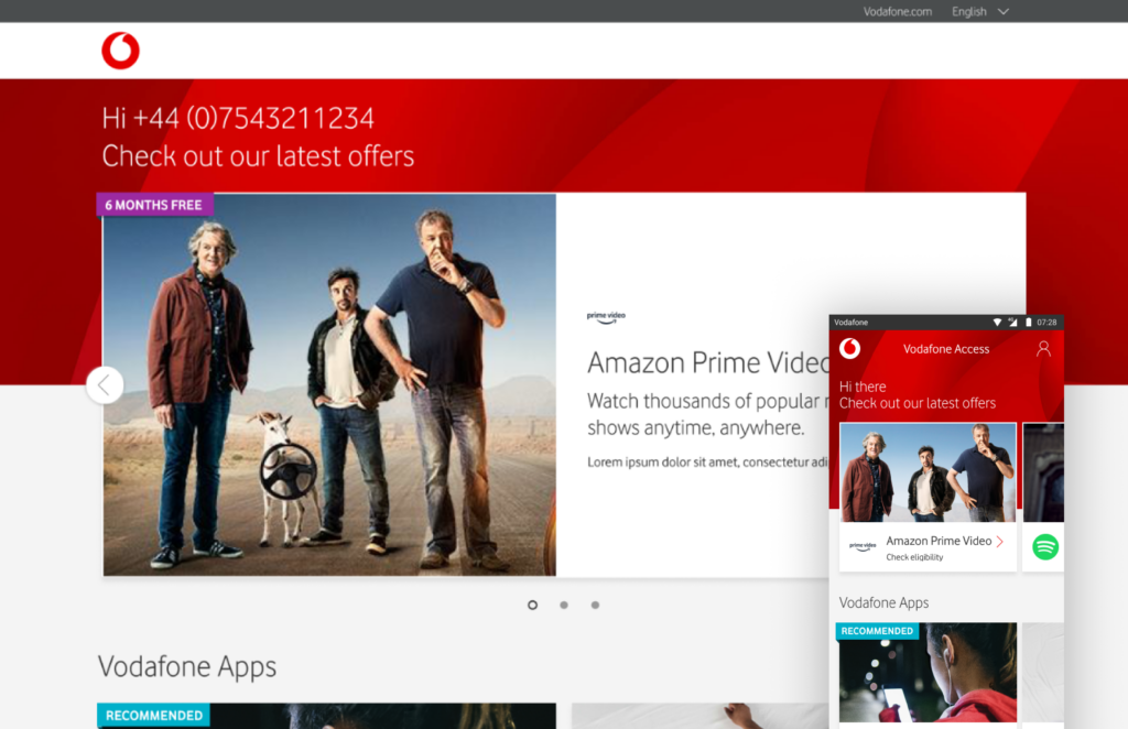
We started by capturing the experience of first run from two angles: what customers tried to accomplish and what Vodafone hoped to achieve. What we learned was that the opportunity wasn't about building extensive onboarding, but offering customers a streamlined layer between no data and browsing online.
Prototyping and variants
Our focus remained on the core goal of Vodafone Start: guiding customers to select relevant add-ons depending on their subscription packages. Various prototypes tested different content densities, layout approaches, placement of actions, and information above the fold.
Customer segmentation for in-store testing was defined by the type of prototype they would be interacting with. As a result, there wasn't much room for demographic-based customer segmentation, but the prototype version allowed us to compare our design choices better.
In-store user testing
Vodafone Start ran on phones, but we did all the testing in two Vodafone stores in London. Over two in-store rounds, 12 customers completed various tasks using different prototypes. Our observation was that regardless of their demographic differences, they had similar behaviors when confronted with a new interface.
The participants came into the store to complete a task unrelated to Vodafone Start. As a result, their tolerance level for a slow, complicated, or lengthy interaction was very low. On the other hand, if the experience was quick to load, clear in its primary actions, and communicated the benefit of taking it, the customers engaged more willingly.
The participants came into the store to complete a task unrelated to Vodafone Start. As a result, their tolerance level for a slow, complicated, or lengthy interaction was very low. On the other hand, if the experience was quick to load, clear in its primary actions, and communicated the benefit of taking it, the customers engaged more willingly.
The main pain point for Vodafone Start was the speed of load. At that point, Vodafone was asking the user to take a few additional tasks while they attempted to get online.
Key changes from in-store testing
As a result of two rounds of testing, we made two tangible changes to Vodafone Start:
1) Height of the fold
Through testing, we found out what the customers saw when Vodafone Start launched, as the amount of information above the fold played a crucial role in engagement. We used this insight to design the optimal fold height and hierarchy.
2) Information available above the fold
We limited the amount of information above the fold and focused on making it as relevant and helpful as possible for the user at that point in the interaction. That meant keeping it succinct, informative, and actionable.
Stakeholder management
Product owners and engineers experienced a lot of pressure to deliver Vodafone Start on time. As a result, we were using prototypes as a tool to manage stakeholders' expectations and provide realistic estimates. Kano modeling provided an objective way to define what features were mandatory and should be part of the first release, what ones had to be delayed and what ones didn't really matter from users' perspective.
Agile working process
Working on an agile team where UX stays a sprint ahead of engineering, we managed to get plenty of space to explore options, iterate prototypes in a store, and refine our designs without causing delays.
Some of the UX artifacts over the course of the year included:
- User flows for the first-run experience.
- Clickable prototypes for stakeholder review.
- Prototype iteration with design refinements.
- Detailed annotations and clarifications for implementation purposes.
Being ahead of the sprint gave us some freedom from the development schedule while still allowing for flexibility.
Outcome
At the end of the year-long project, Vodafone Start was a refined first-run experience aligned with customers' actual behavior at that point. We achieved:
- Streamlined the first screen by limiting its content above the fold.
- Provided stakeholders with detailed artifacts for estimation.
- Illustrated how in-store testing can benefit the experience of a digitally delivered product.

