Role
The UX role in the project was Lead UX Designer. It was an interesting mix of a leadership role and a very hands-on design process. The work included defining the UX direction for the product and then doing the actual detailed design for it.
challenge
Enterprise customers using Vodafone's platform faced challenges with their large and often messy IoT estates. They needed to gain better insight about estate health, suspicious activity, roaming movements, and spending behaviour. While Vodafone’s platform provided access to the relevant data, some users found it hard to draw conclusions and take quick decisions based on their data.
There were some additional constraints to keep in mind when developing the product. It had to be built with Tableau as the base platform, and had to fit inside a specific Vodafone-managed security wrapper. Additionally, it had to integrate seamlessly with the wider Vodafone IoT ecosystem and provide meaningful insight for users with different roles and varying level of data confidence.
Solution
When I started the role, it was clear there were challenges ahead. The platform in question was derived from the existing legacy M2M portal that suffered from multiple issues - instability, dated look and feel, low operational speed, and lack of freshness and accuracy of the data shown.
Meanwhile, the product strategy was clear: reduce the workload on our agents, provide fresher data, and move to cloud-based infrastructure where possible. In other words, this project was not a simple design overhaul. It needed to be a product overhaul, rethinking how things operate, and how to deliver them effectively.
Another challenge, one that cannot be underestimated, was scale. Unlike a simple dashboard project with some nice happy journeys, the product in question was an enterprise-grade product with many features and requirements.
Discovery & validation
The discovery phase focused on uncovering the questions that Vodafone's users faced on a regular basis. Based on discussions with stakeholders and data analysts, it soon became clear that there were some recurring topics that could become a good starting point for analytics dashboards.
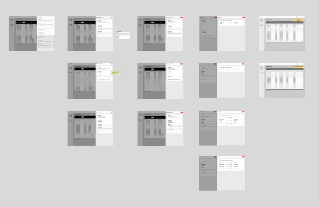
Over the course of the project, some 40 guerrilla user tests were carried out, covering everything from the initial validation of navigation through terminology, dashboard layout and content, to the usefulness of views. At first, the tests were performed with users from Vodafone itself, familiar with the platform and its data. Later, the tests covered various roles of customers using the platform.
User testing proved invaluable when it came to discovering how certain seemingly smart design decisions simply didn't work once they were put to the test. For example, the tests exposed overcomplicated dashboards, poor choice of language, and gaps in navigation that prevented users from getting to the underlying details.
Design approach
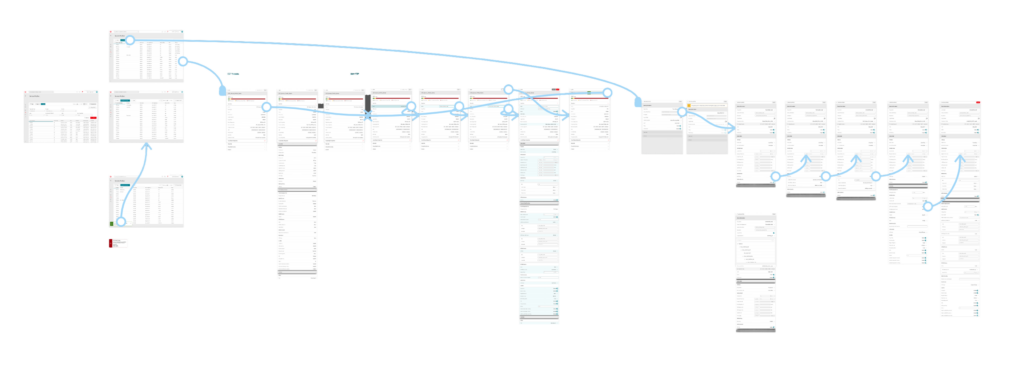
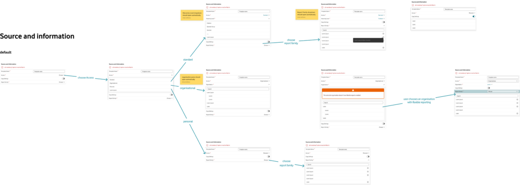
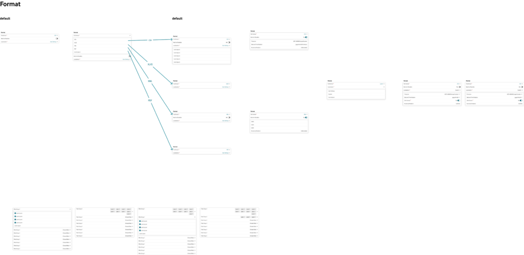
The nature of the analytics experience limited the UX design approach in one important way. Because the product was meant to run in Tableau and fit inside a Vodafone-managed security wrapper, the work had to begin with establishing the overall architecture of the experience, before moving to individual charts.
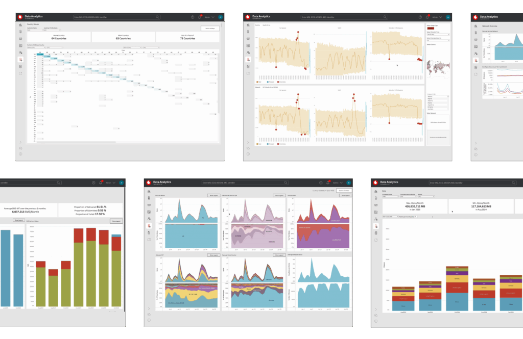
In the process, some reusable design patterns were developed that divided the product into four major categories: Portfolio Health Views, Anomaly Dashboards, Roaming Dashboard and Spend / Overspend Views. Then, consistent design patterns were introduced for the underlying dashboards of each category to provide users with seamless navigation and predictable interface.
One of the design principles applied to the work was progressive disclosure. This meant focusing on showing just a few meaningful signals at first glance, and providing options for going deeper into tables, graphs and more advanced analytics for those occasions when the users really needed to dig deep.
What was designed
As a result, the new analytics experience provided customers with several useful ways of exploring their IoT estate.
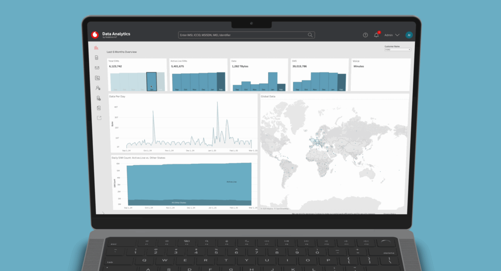
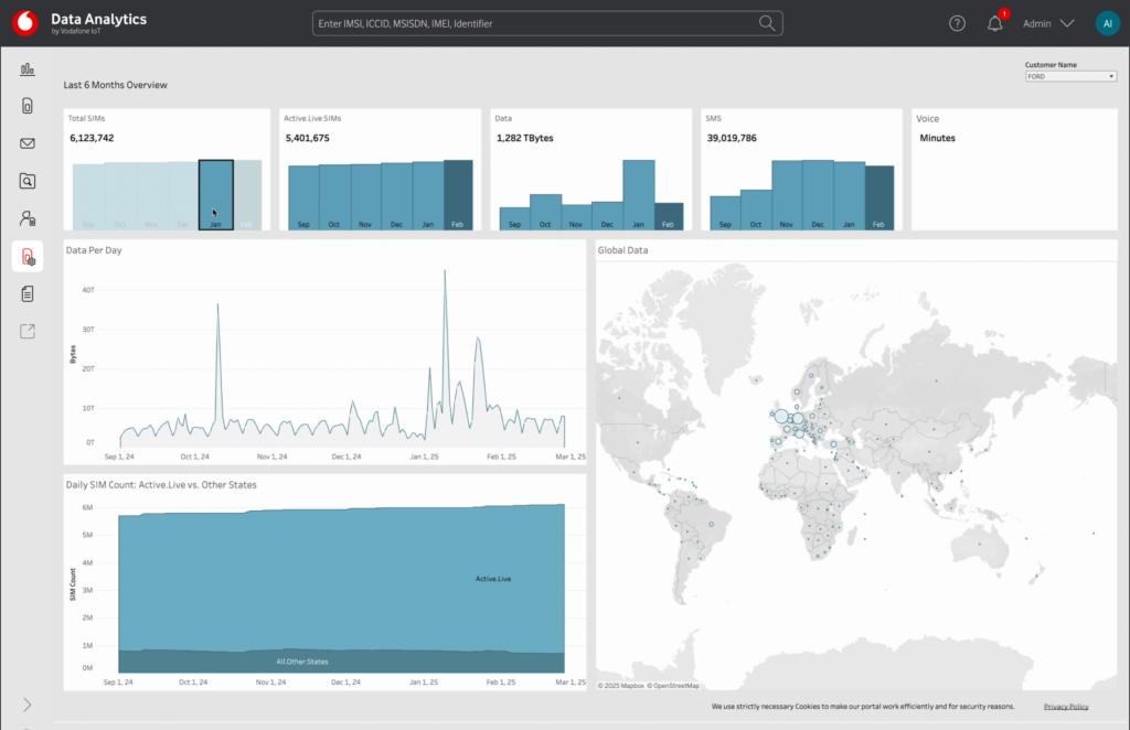
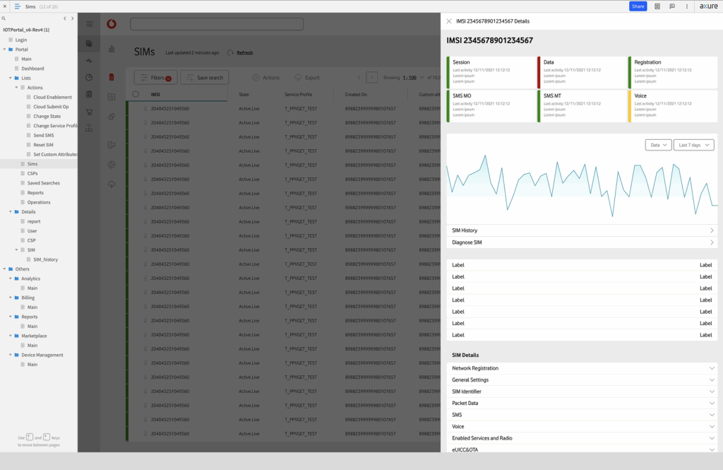
- Portfolio Health Views offered the high-level overview of SIM statuses, usage trends and possible risks. They also helped customers get into more detailed breakdowns of their SIM estates.
- Anomaly Dashboards revealed suspicious activity in an easier to read way, eliminating the need to ask analysts for interpretation of results and taking actions based on them.
- Roaming Dashboard allowed users to see and understand SIM movements, providing valuable insight into regions and countries and helping customers make commercially relevant decisions.
- Spend Views gave an overview of spending behavior, enabling customers to optimize costs and to hold productive conversations with Vodafone salespeople.
As you may have noticed, the product was not particularly fancy. The idea was to design a useful and practical analytics tool that helps people find the next useful answer fast.
Leadership & collaboration
Another big part of the work consisted in alignment. Different product, analytics, engineering and commercial teams had different priorities, and the UX role here was to provide guidance and ensure the decisions would be guided by user needs.
At the same time, the work remained hands-on. This meant working on creating the architecture of the experience, designing navigation, interactions, and dashboards. User tests and design workshops led to the development of reusable UX frameworks for future iterations of similar projects. Reviews and demo sessions ensured consistent UX.
Outcome
The final result was a new analytics product allowing customers to navigate Vodafone's five years' worth of operational data much easier and get meaningful insight out of it. The new product helped fill a gap between a powerful connectivity platform and the need of the users to make business decisions based on the relevant data.
While there were no formal KPIs to demonstrate the effectiveness of the product design, there was certainly some success in creating a reusable UX framework and minimizing the work required to produce one-off dashboards. This case study also demonstrated how important it is to combine leadership and design work.
Reflection
Good analytics UX is not only about designing charts and making data look appealing. It also requires the careful validation of the underlying data and identification of user needs. And in this particular project, it required dealing with the complexity of a B2B product.
Analytics UX often involves dealing with large-scale and sometimes messy datasets. The challenge in this project was to turn this complexity into something simple and useful for the users.