Role
The UX role in the project was Lead UX Designer. It was an interesting mix of a leadership role and a very hands-on design process. The work included defining the UX direction for the product and then doing the actual detailed design for it.
Context and Objectives
The current checkout had become an organic system: it worked but was frustrating to use. Some issues included the lack of progress tracking, unclear logic behind promotions, and minor UX friction points, particularly on mobile devices.
The checkout redesign should accomplish the following:
The checkout redesign should accomplish the following:
- Reduce the amount of friction throughout the whole checkout process for mobile and desktop users
- Clarify progression through the process and reduce user anxiety
- Present promotions and delivery information without overwhelming users
- Test the proposed journey with actual customers before development
As the Senior UX designer, I was responsible for leading the checkout flow design process and the adjacent steps, working closely with visual designers, developers, and UX researcher.
Solution
When I started the role, it was clear there were challenges ahead. The platform in question was derived from the existing legacy M2M portal that suffered from multiple issues - instability, dated look and feel, low operational speed, and lack of freshness and accuracy of the data shown.
Meanwhile, the product strategy was clear: reduce the workload on our agents, provide fresher data, and move to cloud-based infrastructure where possible. In other words, this project was not a simple design overhaul. It needed to be a product overhaul, rethinking how things operate, and how to deliver them effectively.
Another challenge, one that cannot be underestimated, was scale. Unlike a simple dashboard project with some nice happy journeys, the product in question was an enterprise-grade product with many features and requirements.
Approach
From sketches to structure
I started with paper and pen, then proceeded to sketches in Omnigraffle. First, I sketched different step structures (fewer vs many), as well as different solutions on how and when to present promotions and delivery thresholds to the user. Finally, sketches allowed me to generate relevant stakeholder discussion questions, e.g., "What do we definitely need to ask here?"
During initial sketches, I worked mainly by myself and used these to discuss the structure with my colleagues and the client in a series of short meetings.
End-to-end prototype creation
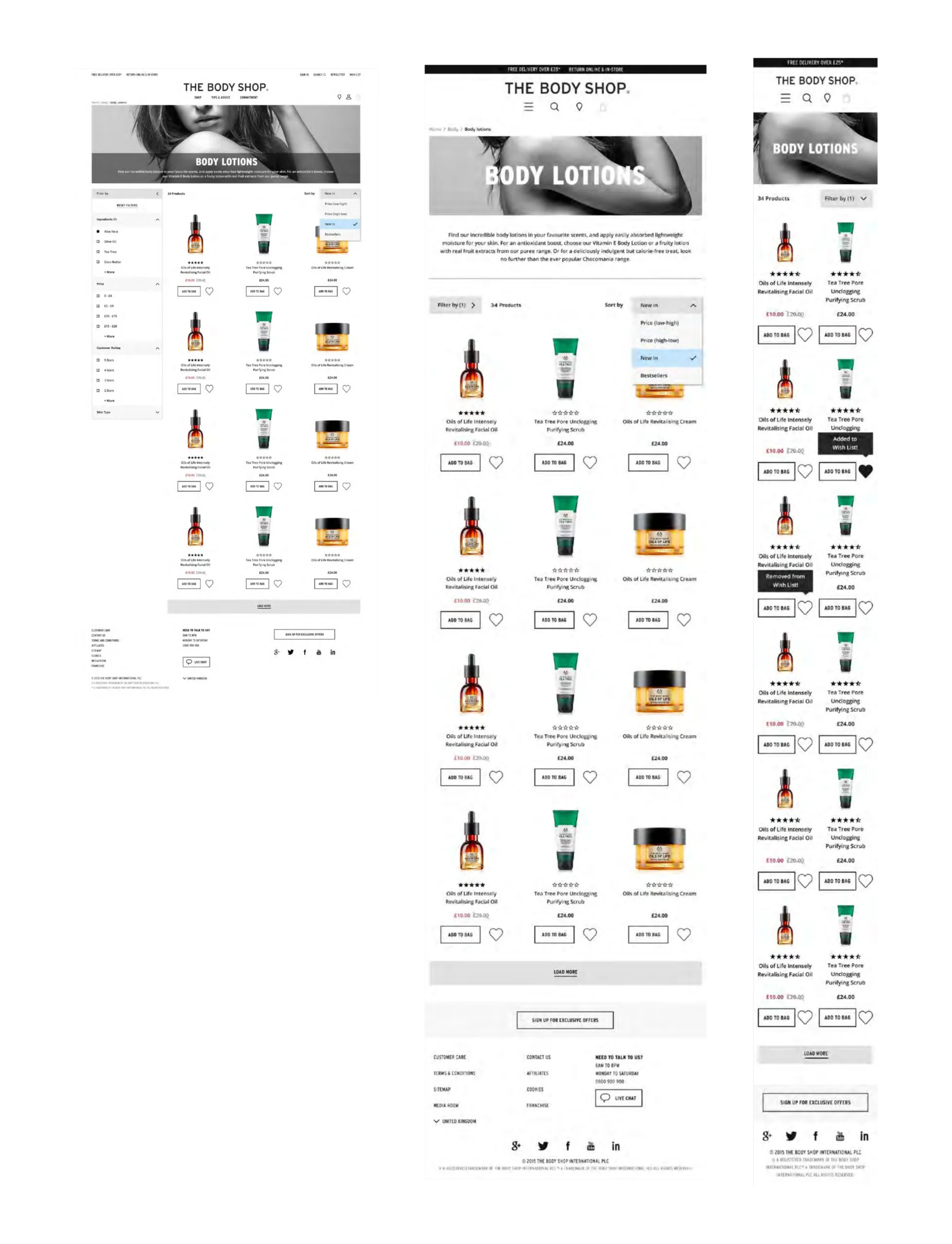
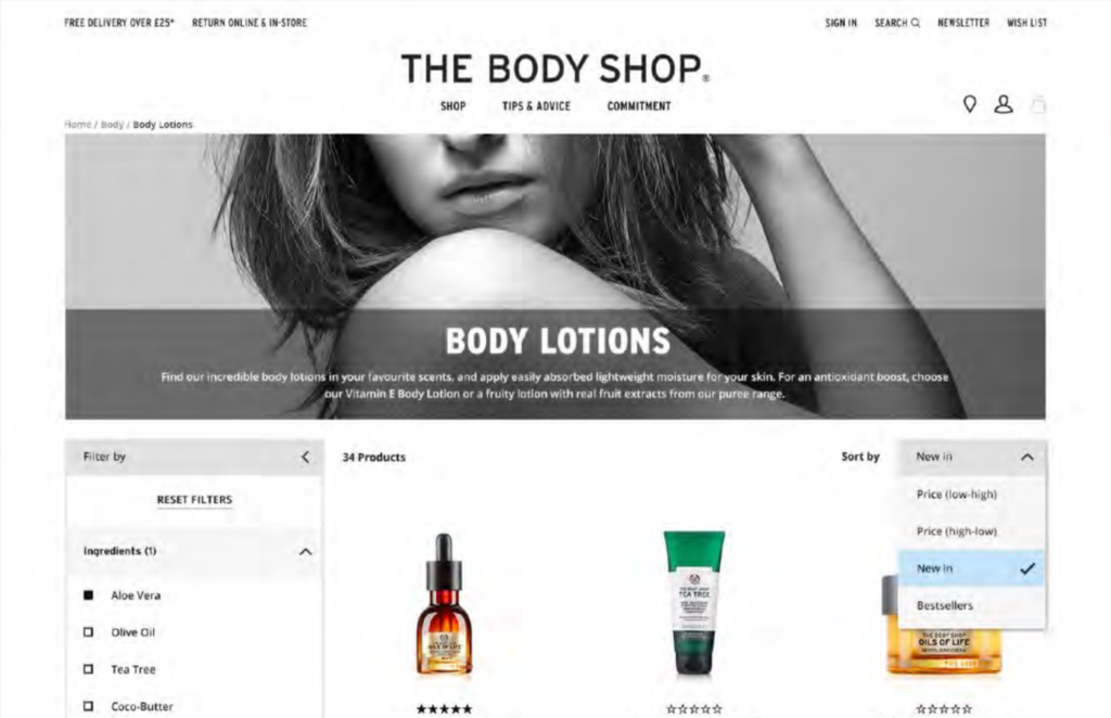
Once we agreed on the general flow, I created a fully functional, responsive checkout prototype using Axure.
The prototype contained:
The prototype contained:
- Multiple entry points from the shopping basket page and other calls-to-action
- All steps of the journey from address and delivery options to payment and order confirmation
- Different edge cases: failed promo codes, incomplete mandatory fields, and error messages
- Different states across all screen breakpoints, with special attention to mobile view
Initially, the prototype was quite raw. I created a prototype of the checkout with minimum styling so the participant and the stakeholder would pay more attention to flow, hierarchy, and messaging rather than to colors and images. Gradually, as UI designs appeared, I adjusted the prototype to the final look-and-feel. I kept the design slightly behind the visual stage, so it remained realistic but not perfect.
Axure as a working artifact
The prototype was the core artifact for the entire project. I used the interactive flow to:
- Discuss the journey with the stakeholder in context
- Experiment with multiple layouts of fields and inline validation
- Collect copy, error handling rules, and edge case management information
The clickable prototype allowed designers to check component interactions, developers to understand logic, and stakeholders to experience the journey just like the customer.
User testing
The Axure prototype was tested during a number of moderated user sessions. In our tests, we did the following:
- A UX researcher conducted the test session
- I participated as an observer
- We watched the test in person, took notes, and coordinated our questions through a back channel
This way of conducting user sessions was efficient because:
- The researcher could focus on the participant
- I could ensure important design-related questions weren't left out
- The stakeholders saw actual user behavior in front of them and would easily discuss trade-offs later
Tests involved the following realistic tasks:
- Looking through the basket and making sure it was correct
- Selecting delivery options and understanding their costs and thresholds
- Adding credit card information and understanding the position in the process
- Handling errors: missing mandatory fields, entering a wrong promo code
Learnings and changes
Having a fully-fledged prototype allowed us to iterate in every test phase and make changes based on observed user actions. Among others, we've made the following adjustments:
- Step structure: Participants wanted to know where they were and how many steps were left to complete. So we improved step tracking and adjusted language to reflect the process better.
- Inline validation: Minor form details were significant for the participant experience, so we experimented with form layout and inline validation until users understood everything intuitively.
- Promotions and delivery: We tried different ways of displaying these two elements to make offers obvious and appealing to the user without taking him/her off the main checkout path.
In each phase, we observed, captured issues, made changes, sketched alternatives, updated the prototype, and re-tested.
Collaboration and workflows
Being in both the agency and client's environment allowed for flexible collaboration. With my agency team, I shared Axure files, added annotations, and sent photos of my sketch notes to explain particular interactions to art directors and developers. In meetings with the client, I presented updates to the prototype to show changes in action to non-design stakeholders. Also, despite having an interactive prototype ready, I still sketched some steps to brainstorm design ideas without affecting the current prototype version.
Impact
Though I can't mention specific numbers, the checkout redesign and its prototype:
- Created a reliable basis for the development process and reduced misunderstandings between teams
- Provided common ground for discussion with both agency and client teams
- Allowed us to discover UX issues earlier when they were relatively cheap to solve via sketches and prototypes
Outcome
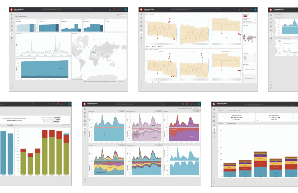
The final result was a new analytics product allowing customers to navigate Vodafone's five years' worth of operational data much easier and get meaningful insight out of it. The new product helped fill a gap between a powerful connectivity platform and the need of the users to make business decisions based on the relevant data.
While there were no formal KPIs to demonstrate the effectiveness of the product design, there was certainly some success in creating a reusable UX framework and minimizing the work required to produce one-off dashboards. This case study also demonstrated how important it is to combine leadership and design work.
Reflection
Good analytics UX is not only about designing charts and making data look appealing. It also requires the careful validation of the underlying data and identification of user needs. And in this particular project, it required dealing with the complexity of a B2B product.
Analytics UX often involves dealing with large-scale and sometimes messy datasets. The challenge in this project was to turn this complexity into something simple and useful for the users.